
B2B SaaS Homepage Messaging: What Belongs Above the Fold
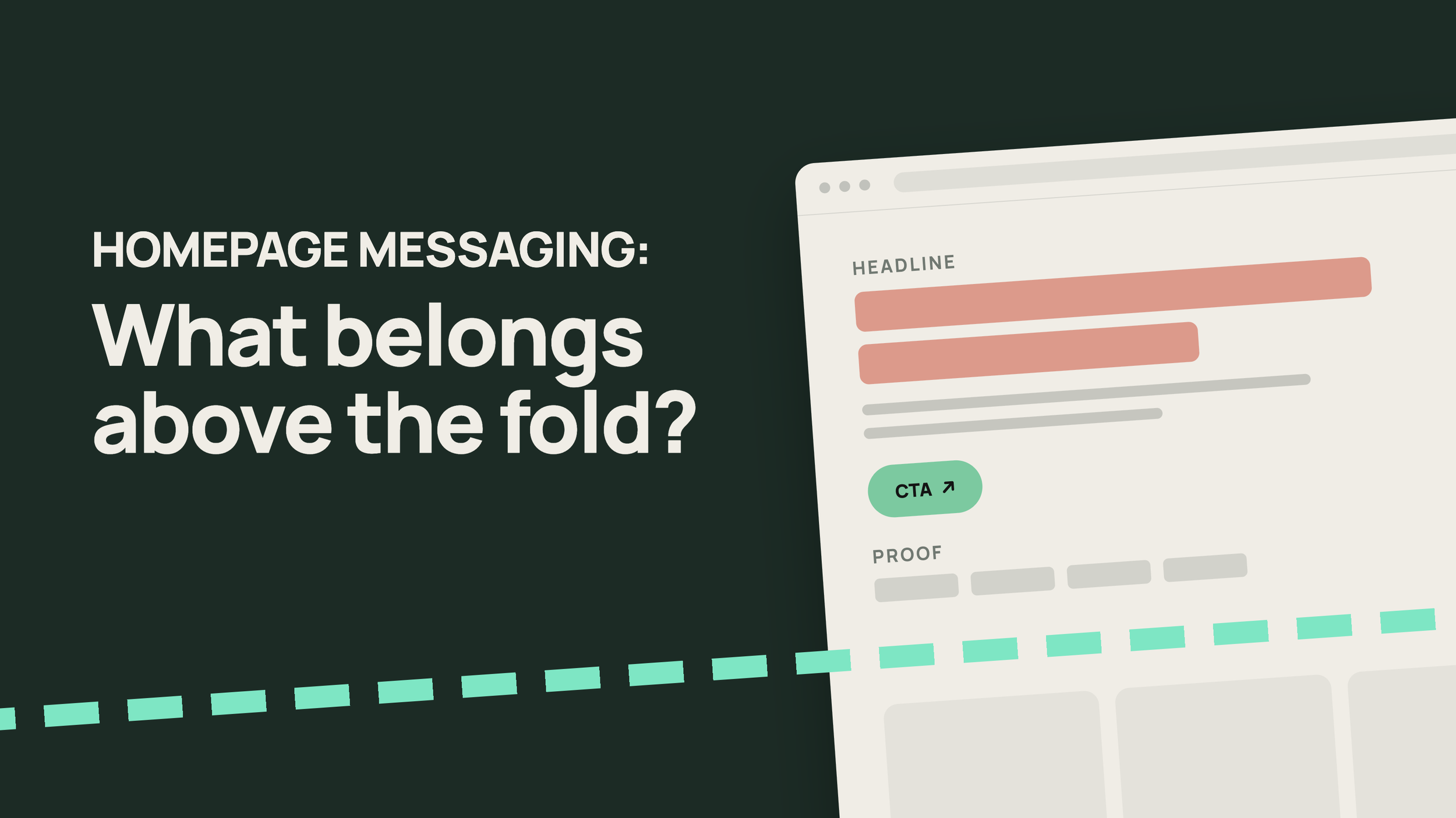
B2B SaaS homepage messaging has four jobs above the fold. The headline says what changes for the buyer, the subhead says what the product is and who it's for, one line of proof gives a reason to believe it, and a single primary CTA names the next step. A visitor who has never heard of you should be able to say what you sell and who it's for within about ten seconds.
Your homepage went through four rounds of review, and every sentence on it is true. Product signed off on the capabilities, the CEO picked the word "platform," and the customer logos cleared legal. However, homepage demo requests have been flat for two quarters anyway, and your SDRs have started opening discovery calls by explaining what the company does.
Read the hero section the way a stranger would. The headline says something like "The unified platform for modern revenue teams," the subhead lists six capabilities, and two buttons offer "Get started" and "Book a demo." A buyer who already knows your category can decode it. Everyone else leaves before the first scroll, and the few who book a call arrive expecting a different product.
Accurate homepages fail this way all the time. The copy was written to describe the product to the people who built it, so it answers their questions in their vocabulary. The visitor arrives with one question of their own, which is whether this company solves the problem they came in with, and most homepages get around to answering it somewhere near the fourth scroll.
- Above the fold has four jobs: a headline that says what changes, a subhead that says what the product is and who it's for, one line of proof, and one primary CTA.
- Write for the visitor who has never heard of you. Buyers build their shortlist before they talk to sales, so the homepage makes your case first.
- Run the swap test. Put your closest competitor's logo above your homepage headline. If the line still works, it gives nobody a reason to pick you.
- Name the category above the fold. Lead with the outcome when buyers know the category, and let the subhead name it in the words buyers search for.
- Keep product detail to one visual. Feature grids, integration lists and platform diagrams belong below the fold.
- Give the primary CTA one job, and label it with what happens after the click.
- Diagnose before you rewrite. Each symptom, from low scroll depth to confused first calls, points to a different line on the page.
- If the team can't agree on the headline, fix the positioning first. Headline debates that run three rounds are usually disagreements about who the product is for.
What Should B2B SaaS Homepage Messaging Say Above the Fold?
B2B SaaS homepage messaging above the fold should tell a first-time visitor what the product does for them, what kind of product it is, who it's built for, why they should believe it, and what to do next. "Above the fold" means the first screen a visitor sees without scrolling, on a laptop and on a phone. Everything past that screen is optional reading, and visitors treat it that way.
Most visitors decide whether to keep reading on that first screen. Nielsen Norman Group's scrolling and attention study found that users spent 57% of their page-viewing time above the fold. Jakob Nielsen's research on dwell time found that people often leave a page within 10 to 20 seconds, and that pages holding attention for longer communicate their value proposition within the first ten.
B2B buyers also meet your homepage well before they meet your team. 6sense's 2025 Buyer Experience Report, based on nearly 4,000 buyers, found that buyers make first contact with a vendor 61% of the way through their journey, and that the winning vendor is already on the day-one shortlist 95% of the time. In Wynter's survey of 100 B2B SaaS CMOs, every one of them visited the vendor's website before deciding. One respondent put the stakes plainly: "If I can't map their solution to my problem from the website alone, I'll skip the demo."
The Four Jobs Above the Fold
Each element in the hero section has one job. When one element tries to do two jobs, or two elements try to do the same one, the visitor has to assemble the message themselves.
| Element | Its job | Common failure | Quick test |
|---|---|---|---|
| Headline | Say what changes for the buyer | Describes the company's ambition | Would a buyer repeat it to their boss? |
| Subhead | Say what the product is, who it's for, and how it works | Lists every capability | Can a stranger name your category after reading it? |
| Proof | Give one reason to believe the headline | A logo row nobody in your ICP recognizes | Would your buyer know three of these names? |
| Primary CTA | Offer one next step | Two equal buttons with vague labels | Does the label say what happens after the click? |
A product visual sits alongside the four and shows the product doing what the headline promises. Navigation, cookie banners and announcement bars also compete for the first screen, so keep each of them to a single line.
What Makes a Homepage Headline Work?
A homepage headline works when a buyer who has never heard of you reads it once and recognizes their own problem or the result they want. It uses the buyer's words, it's specific enough that a competitor couldn't claim it, and it's short enough to take in at a glance. Five tests catch most weak headlines.
1. It uses the buyer's words. The phrase buyers use for the problem on sales calls belongs in the headline. If three buyers call it "close weekend" and your homepage says "financial operations complexity," your homepage is the one using the wrong term.
2. It passes the swap test. Put your closest competitor's logo above your headline and read it again. If the line still reads as true, it describes the category and gives the buyer no reason to pick you.
3. It makes a claim someone could disagree with. "Better visibility into your pipeline" is safe because nobody would argue against it. "Forecasts your reps don't have to rebuild on Thursday night" is specific enough that a buyer either recognizes the problem or doesn't, and both answers help you.
4. It reads in one glance. Aim for 6 to 12 words, which fits on two lines on a laptop and three on a phone. Longer headlines usually carry two ideas, and the second one belongs in the subhead.
5. A rep would say it out loud. If your sales team would never open a call with the sentence, it probably doesn't describe the product the way buyers hear it. Olivine's piece on why your brand messaging never makes it to sales conversations covers what happens when the homepage and the sales pitch drift apart.
The pairs below are illustrative and written for invented products. Each specific version names a buyer, a problem or a measurable result that the vague version leaves out.
| Element | Its job | Common failure | Quick test |
|---|---|---|---|
| Headline | Say what changes for the buyer | Describes the company's ambition | Would a buyer repeat it to their boss? |
| Subhead | Say what the product is, who it's for, and how it works | Lists every capability | Can a stranger name your category after reading it? |
| Proof | Give one reason to believe the headline | A logo row nobody in your ICP recognizes | Would your buyer know three of these names? |
| Primary CTA | Offer one next step | Two equal buttons with vague labels | Does the label say what happens after the click? |
Every specific version is harder to write, because each one commits the company to a buyer and a promise. That commitment is also why so many headline projects stall, which the positioning section below comes back to.
Should Your Homepage Headline Name the Category or the Outcome?
Lead your homepage headline with the outcome when buyers already understand your category, and with the category when they don't yet know what kind of product you are. Whichever one leads, the other belongs in the subhead, so both appear above the fold.
The category tells a buyer which shelf to put you on, what to compare you against and roughly what you should cost. The outcome tells them why you're worth considering over everything else on that shelf. A headline with only an outcome leaves the buyer guessing what you sell, and a headline with only a category leaves them guessing why they should pick you.
The category matters to machines as well. Search engines and answer engines like ChatGPT and Perplexity use the words on your homepage to decide what you are, and a buyer asking for "expense management software for mid-market companies" only gets your name back if your page says that's what you are. In Wynter's survey, 24% of CMOs already use AI tools like ChatGPT to summarize and compare vendors.
| Your situation | Lead the headline with | Put in the subhead |
|---|---|---|
| Buyers know the category and you're one of many options | The outcome that sets you apart | The category, in the words buyers search for |
| Buyers don't know the category exists yet | The problem they already have | The category and what it replaces |
| You're repositioning into a different category | The new category | The outcome that justifies the move |
| You're the category leader with strong recognition | Either one, since your brand does part of the work | The scope of the product |
Our article on the two AI positioning traps makes the same argument for AI products. Companies that spend the headline proving what they are, with words like "AI-native" or "agentic," give up the space where they could say what they deliver. As that piece puts it, lead with the outcome, then use the architecture as proof.
What Do B2B Value Proposition Examples From Known Brands Show?
We checked the homepages of twelve well-known B2B SaaS companies in September 2026. The seven B2B value proposition examples below show the range, and every one of them names its category somewhere above the fold, even when the headline leads with an outcome or a concept.
| Company | Homepage headline | Leads with | Where the category appears |
|---|---|---|---|
| Stripe | "Financial infrastructure to grow your revenue." | Category and outcome together | In the headline |
| Datadog | "AI-Powered Observability and Security" | Category | In the headline |
| Linear | "The product development system for teams and agents" | Category | In the headline |
| Ramp | "Time is money. Save both." | Outcome | The subhead lists cards, expenses, bill payments and banking |
| Clay | "Build systems to grow revenue" | Outcome | The subhead calls it infrastructure for data, workflows and GTM plays |
| Attio | "Welcome to agentic revenue." | A concept | The subhead opens with "Attio is the CRM that builds pipeline" |
| PostHog | "Make your product self-driving" | A concept | The subhead says it already has your analytics and errors |
Two patterns stand out. The first is that companies with concept headlines hand the category to the subhead straight away, so a visitor still learns what they are within one line. The second pattern is how often AI appears: six of the twelve headlines we checked put AI or agents in the headline itself, and when half a market leads with the same word, that word stops telling a buyer anything about any one company.
These are also companies most buyers already know. Ramp can open with a five-word play on a proverb because a finance leader landing on its homepage usually knows what Ramp sells. A Series A company with a fraction of that recognition needs its hero section copy to do the work Ramp's brand does, which makes copying a famous homepage one of the riskier moves in a website project.
How Much Product Detail Belongs in the Hero Section?
The hero section needs enough product detail for the visitor to picture using the product. In practice that means one product visual showing the moment the headline promises, and at most two or three capabilities named in the subhead. Feature grids, integration logos and platform diagrams belong further down the page, where visitors who are already interested go looking for them.
The product visual carries more weight than most teams give it. A cropped screenshot of the finished report, the alert or the approved invoice shows the result the headline promised, and buyers believe a picture of the result more readily than a sentence about it. A full-dashboard screenshot with thirty unreadable widgets mainly tells the visitor the product is complicated, and an abstract illustration of glowing connected nodes tells them nothing at all.
Technical buyers change the calculation. Developer tools often put a code snippet or a terminal command above the fold, because for that buyer three lines of code are the most specific proof available. If your economic buyer and your technical evaluator are different people, write the hero section copy for whoever starts the evaluation and give the other one a clear path below the fold.
Often the most useful piece of product detail is the thing you replace. A line like "replaces the Friday export" or "without a second CRM" tells buyers exactly where you fit in their stack, in fewer words than a capability list.
What Belongs Below the Fold?
Once the hero section has earned the scroll, the rest of the page answers the questions buyers ask next, in roughly the order they ask them. Visitors who scroll are already interested, so this is where detail earns its place.
| Above the fold | Below the fold |
|---|---|
| The outcome, in the buyer's words | How the product works, in three or four steps |
| The category and who it's for | Capabilities, grouped by the job each one does |
| One product visual | Case studies and named results |
| One line of proof | Integrations, security and compliance detail |
| One primary CTA and one secondary route | Paths for other personas, pricing and a closing CTA |
What Should the Subhead and the Primary CTA Each Do?
The subhead explains the headline. It says what the product is, who it's for and how it delivers the promise, in one or two sentences of about 20 to 30 words. The primary CTA offers a single next step that matches how you sell and how ready the visitor is.
A reliable subhead shape is "[Product] is the [category] for [buyer] that [how it works], so [result]." Attio's subhead follows it closely, putting the category in its first four words ("Attio is the CRM") directly under a headline that doesn't name one. The formula reads flat on its own, and that's acceptable, since the subhead's job is clarity and the headline gets to be the memorable line.
Subhead failures are easy to spot once you look for them. The subhead repeats the headline in longer words, lists six capabilities separated by commas, or addresses a different buyer from the one the headline was written for.
Your primary CTA should match your sales motion. Sales-led companies usually lead with "Book a demo" and product-led companies with "Start free," while hybrid companies have to pick one and make the other secondary. Two buttons with equal weight ask the visitor to make a decision your team should have made for them.
Label the button with what happens next. "Book a demo" tells the visitor they'll see the product with a person, while "Get started" could lead to a signup form, a sales call or a pricing page. Buyers start most vendor conversations themselves, 79% of them in 6sense's 2025 data, so the primary CTA has to be easy to find on the day a buyer is ready. Until that day, a secondary route such as a two-minute product tour or a pricing link keeps a researching buyer on your site.
Put the proof directly under the CTA. One row of customer logos the buyer recognizes, one result with a named customer, or a review rating will do the job. Choose one, since three kinds of proof stacked in the hero push the CTA down the page.
How Do You Know Your B2B SaaS Homepage Messaging Is the Problem?
Your B2B SaaS homepage messaging is the likely problem when traffic arrives from the right companies and leaves without acting, or acts and then turns out to have misunderstood what you sell. Each symptom points to a different line on the page, so diagnose before anyone opens a rewrite doc.
| Symptom | What it usually means | Where to check |
|---|---|---|
| Most visitors leave without scrolling | The headline doesn't land with the buyer | Scroll maps and session recordings |
| Visitors scroll the whole page and don't click | The proof or the CTA isn't doing its job | Click maps and CTA conversion rate |
| First sales calls open with "so what exactly do you do?" | The subhead doesn't name the category clearly | Call recordings from the last month |
| Demo requests come from poor-fit companies | The headline speaks to the wrong buyer | Closed-lost reasons and lead source in your CRM |
| ChatGPT or Perplexity describes you as the wrong kind of product | The category is unclear or missing from the page | Ask three answer engines what your company does |
| Reps describe the product differently from the homepage | The messaging was written without sales | Five recent call recordings |
The answer engine check takes five minutes, and it's rarely on anyone's list. Ask ChatGPT, Perplexity and Google's AI Mode what your company does and who it's for, then compare the answers with your hero section. When all three put you in the wrong category, your homepage is usually where they got the idea.
How Do You Test SaaS Homepage Copy Before You Ship It?
Run a stranger test before any change to your SaaS homepage copy goes live. Show the hero section on its own for five seconds to five people who match your ICP and have never seen your site. Then ask three questions: what does this company sell, who is it for, and what would you click first.
If three of the five can't answer the first question, the subhead needs work. If they name the right category and the wrong buyer, the headline is aimed at someone else. Tools like Lyssna run five-second tests with recruited panels, and message-testing services like Wynter recruit B2B buyers by job title, which helps when your ICP is hard to reach through your own network.
Then compare the copy with how buyers talk. Pull the phrases buyers used to describe their problem in recent calls or customer interviews, and check whether any of them appear on your homepage. If none do, you've found your first rewrite.
When Is a Homepage Messaging Problem Actually a Positioning Problem?
A homepage messaging problem is a positioning problem when the team can't agree on what the headline should say, because the disagreement sits underneath the copy. Positioning is the set of decisions about who you're for, what you compete against, which category you're in and what makes you different. Messaging turns those decisions into language, and a homepage can only be as clear as the decisions behind it.
Our guide to the difference between positioning, messaging, and copywriting draws the lines this way: positioning is "where your product fits in the market, who you serve, what you're doing, and how you're different," messaging is "the clarity of what you say about your product," and copywriting is "the cleverness of how you communicate it all." Homepage projects stall when a team tries to settle the first while writing the third, and five signs usually give it away.
The headline has been through three rounds and nobody is happy. Each draft is fine, and each stakeholder rejects it for a different reason. Those reasons usually turn out to be different answers to who the product is for.
Every version tests about the same. When five headlines score within a few points of each other, the wording probably isn't the variable. In every version, the buyer still can't tell why this product is different from the alternatives.
The best headline could belong to three companies. The team has settled on a line that passes review because it commits to nothing. It fails the swap test, and no rewrite fixes that until the company picks a difference to lead with.
Sales, the homepage and the pitch deck describe three different products. Each team filled the gap with its own version. Buyers hear all three, often in the same week.
The homepage tries to speak to every persona at once. If you haven't chosen a primary buyer, the hero section can't choose one either. Olivine's guide to ICP vs. buyer persona covers how to decide which buyer the page is for.
For a quick check, try to complete Geoffrey Moore's positioning statement from Crossing the Chasm: "For [target customer] who [has this problem], [product] is a [category] that [key benefit]. Unlike [primary alternative], we [key difference]." If your leadership team can fill every bracket in ten minutes and agree on the answers, you have a messaging problem and a copy rewrite will fix it. If the brackets start an argument, settle the positioning first and write the homepage second.
Olivine's positioning and messaging work starts at this point, with workshops that get product, sales and leadership to agree on those answers before anyone drafts a headline. When the positioning moves far enough, the visual identity often has to catch up too, since new messaging in an old brand still looks like the old company. That's the job of brand identity design.
Rewrite One Line This Week
A full website project can wait. One headline, one test and a 30-day baseline will tell you whether the rest of the page needs work.
1. Screenshot your hero section on a laptop and a phone. Crop each one at the fold. This is the only part of the page you're working on this week.
2. Run the swap test. Paste your closest competitor's logo above your headline and read it again. Write down whether the line still works for them.
3. Pull three buyer phrases. Listen to three recent first calls or read three recent win notes, and write down the words buyers used for the problem. Keep their wording exactly as they said it.
4. Write five headlines. Build each one around a buyer phrase and keep each under 12 words. Check that the subhead still names your category underneath every option.
5. Test and ship one. Run the stranger test with five people in your ICP, ship the headline most of them understood, and change nothing else on the page. Compare homepage-to-demo conversion over the next 30 days with the 30 days before.
Changing one line keeps the result readable. If conversion moves, you know which line moved it, and if it stays flat, the problem is likely further down the page or further back in the positioning.
Work With Olivine on Your Homepage Messaging
If your homepage describes the product accurately and still isn't bringing in the right buyers, the fix usually starts with the messaging above the fold and sometimes with the positioning underneath it.
Olivine's website design and copy work combines product marketing with conversion-focused design, so the words and the layout are built from the same positioning.
For Stellar, a live-streaming platform for event producers, the project covered a messaging and positioning framework, personas and jobs-to-be-done research, a brand style guide, and design and copy for 12 pages.
Visit Olivine's website design and copy page to see how we run website projects for B2B SaaS teams, or get in touch to talk through what your homepage needs to say first. Most website projects take 4 to 12 weeks, depending on the number of pages and the scope.
Frequently Asked Questions About B2B SaaS Homepage Messaging
How long should a B2B SaaS homepage headline be? A B2B SaaS homepage headline should run about 6 to 12 words, which is short enough to read at a glance and fits on two lines on a laptop. Specificity matters more than length. A 12-word headline that names the buyer's problem does more work than a four-word slogan any company in the category could use.
Should you name competitors on your homepage? Most B2B SaaS companies should keep competitor names off the homepage. Naming a rival above the fold gives them attention from buyers who may not have been considering them. Name the alternative you replace instead, such as spreadsheets or an agency, and put head-to-head comparisons on dedicated pages where buyers searching for them will land.
Do logos above the fold help? Customer logos above the fold help when your buyers recognize them as peers. A row of companies from the visitor's industry or size band tells them the product works for businesses like theirs, while unfamiliar or mismatched logos add little. Place one row directly under the CTA and put the case studies behind it further down.
How often should you rewrite homepage copy? Rewrite homepage copy when your positioning changes, such as a move upmarket, a new product line, a new category or a shift in who buys. Review it against recent call recordings every six months even when nothing has changed. Single lines can be tested more often, and a quarterly headline test suits most B2B SaaS teams.
Should the homepage speak to one persona or several? A B2B SaaS homepage should speak to one primary persona above the fold, usually the champion who starts the evaluation. Route other personas below the fold through role-based sections or links to solution pages. A headline written for three buyers at once ends up specific to none of them, and all three keep scrolling.